Nucleus Design System
A system-wide modernization of Medable's clinical trial component library, delivering full dark mode, semantic token architecture, automated quality gates, and design-to-code parity across a regulated product suite.
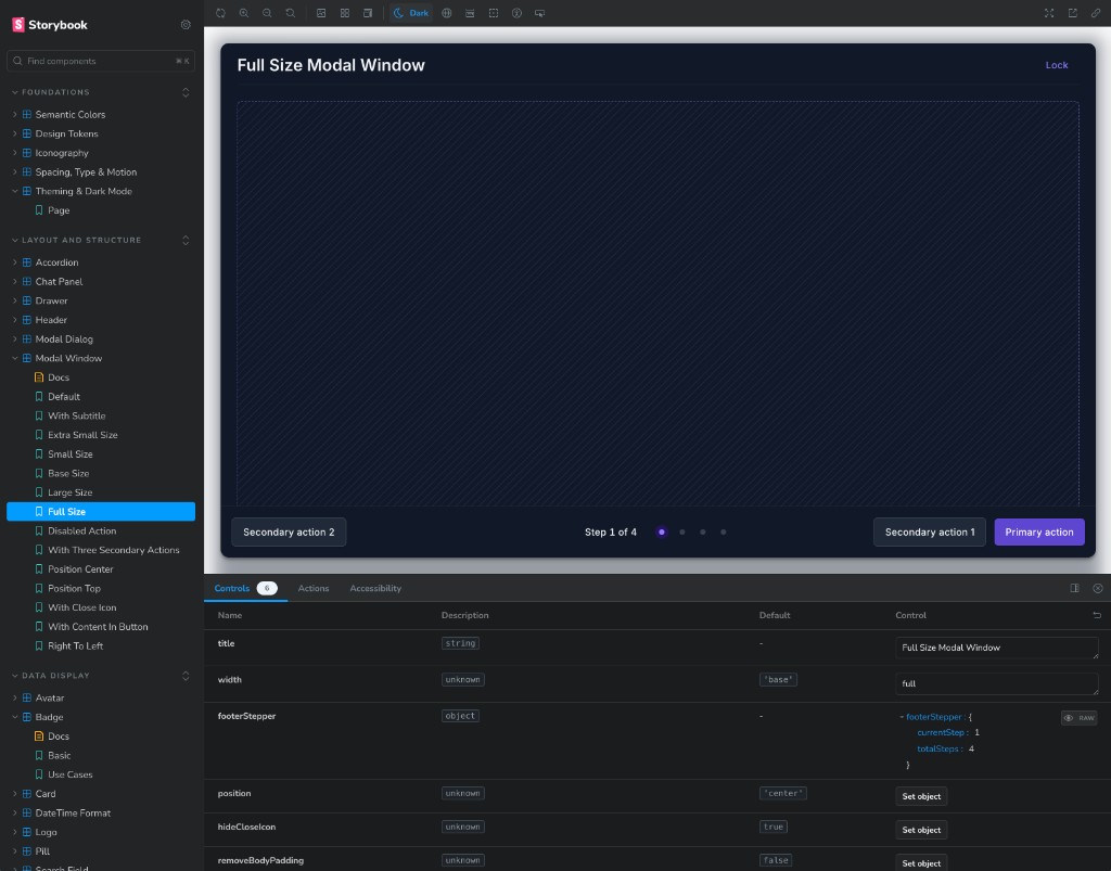
Debt that had to be fixed systematically.
Nucleus powers clinical trial interfaces across 13+ applications: form views, summary panels, and data-dense dashboards where accuracy and clarity are non-negotiable. The library carried visual and technical debt that needed to be addressed systematically.
- Dark mode was broken: invisible text, washed-out surfaces, disappearing controls
- Typography inconsistencies between Storybook and consuming apps
- Icons at inconsistent weights and sizes across components
- Hardcoded color values scattered across 11 components
- No visual regression testing; drift caught only by eye
- Production-quality dark mode across the full component set
- Self-hosted Inter Variable with pixel-for-pixel Storybook parity
- Heroicons-standard 1.5px strokes, correctly sized at every breakpoint
- Semantic token layer as a single source of truth from Figma to CSS
- 572 pixel-diff baselines in CI across light and dark
Constraints that shaped the work
13+ live applications, zero downtime tolerance
Every consuming app had to keep shipping while the token layer under it changed. The work had to stay additive and backward-compatible at every stage, not a rip-and-replace.
Regulated product, so looks fixed was not good enough
In a GxP-adjacent context, a visual regression that slips through is not just a bug; it is a potential compliance and data-legibility issue. That is what justified 572 pixel-diff baselines instead of manual review alone.
Pre-existing accessibility debt could not block the team
A large volume of a11y issues predated this work. Gating CI on 100% clean axe-core results immediately would have stopped all component shipping, so debt was triaged into a burn-down list instead of an all-or-nothing gate.
Headline work: full dark mode
Dark mode went from broken to production-quality across every component. The solution required a semantic token architecture, not just toggling colors, built around a codified surface elevation model. In light mode, shadows carry depth; in dark mode, shadows disappear, so surfaces must carry it instead.
| Level | Name | Surface token | Shadow | Used for |
|---|---|---|---|---|
| −1 | Sunken | bg-surface-sunken | shadow-inner | Segmented-control track, progress trough |
| 0 | Flush | bg-background | shadow-none | The page itself |
| 1 | Raised | bg-surface | shadow | Cards, table rows, inputs |
| 2 | Floating | bg-surface | shadow-lg | Dropdowns, popovers, tooltips, pickers |
| 3 | Overlay | bg-surface | shadow-2xl | Modal windows and dialogs above a scrim |
Six areas of improvement
Semantic token architecture
Figma variable exports piped through a codegen script into CSS custom properties. One toggle flips the entire system between light and dark.
- →Figma Variables → semantic_tokens.ts → CSS
- →Neutral scale as RGB channels for Tailwind opacity modifiers
- →Token drift guard wired into CI
Typography system
Standardized on Inter Variable, chosen for open-source licensing and strong handling of dense numeric data in clinical contexts.
- →Self-hosted via @fontsource-variable/inter
- →H1/H2 display weights and letter spacing corrected
- →Tabular, lining numerals in data tables
Iconography standards
Unified icon weight, size, and color behaviour across the component set in both themes.
- →Solid icons on all buttons
- →Heroicons-standard 1.5px strokes via non-scaling-stroke
- →Fixed icon-default dark value that was never flipped
Component polish
Systematic contrast, spacing, border, focus-state, and hover-state fixes applied across the full library.
- →Forms, overlays, tables, modals, nav, badges, chat panel
- →New: Pagination, Drawer/Sheet, Progress components
- →Motion tokens for consistent animation timing
Tooling and DX
Automated quality gates catch regressions before they ship, replacing slow manual screenshot review.
- →572 pixel-diff baselines, light and dark
- →axe-core WCAG 2.1 AA gate per story, per theme
AI-assisted development
Used Cursor throughout the modernization pass to ship production component code faster, bridging design intent and implementation.
- →Generated and refined Tailwind component variants
- →Accelerated dark mode token migration across 11 components
- →Shared Nucleus patterns with the team via Slack walkthroughs
Design process
Audit and triage
Full component audit across light and dark, documenting every broken state, inconsistent token, and hardcoded value. Findings were organized into a prioritized tier system to sequence the work without blocking the team.
- ·Catalogued all dark mode failures by component and severity
- ·Identified 11 components using a hardcoded hex directly, folded into bg-surface
Token architecture
Designed the semantic token layer before touching a single component. The Figma Variables export became the single source of truth, piped into CSS custom properties that flip between :root and .dark.
- ·Designed the 5-level elevation model in Figma, then implemented in code
- ·Token drift guard built to prevent Figma and CSS from diverging
Component migration
Migrated components tier by tier: dark mode foundation first, then typography, iconography, and component-level polish. Used Cursor to accelerate repetitive token substitutions across the codebase.
- ·Modal, cards, tables, side nav, forms, overlays, and chat panel
- ·New: Pagination, Drawer/Sheet, Progress, and motion tokens
Quality gates
Built automated visual and accessibility gates so the team ships with confidence instead of relying on manual review. Pre-existing a11y debt was documented in a burn-down allow-list rather than blocking CI immediately.
- ·572 pixel-diff baselines captured across every story in light and dark
- ·axe-core WCAG 2.1 AA runs per story, per theme
Documentation and team enablement
Published improvements as living documentation inside Storybook: Foundations pages, a Contributing checklist, and a Storybook Improvements report driven from a shared markdown file.
- ·Foundations: design tokens, theming, iconography, spacing/type/motion
- ·Slack video walkthroughs covering Nucleus layout patterns for the team
Results
Automated quality gates and token unification changed how the team ships components across the regulated product suite.
Reflection
Triaging accessibility debt
The decision to triage pre-existing accessibility debt into a burn-down list, instead of gating CI on a clean slate, is what let this ship without stalling the team. I would socialize the elevation model with engineering earlier next time; it was the right foundation, but landing it before component migration started would have avoided some rework.