Toast Design System
As Toast's web product moved from Bootstrap and Angular to React SPAs, the design team needed a system that could scale with engineering and keep new components in the pattern library. We set a one-quarter timeline for the initial effort and built adoption through research, structured libraries, and tight design-dev collaboration.
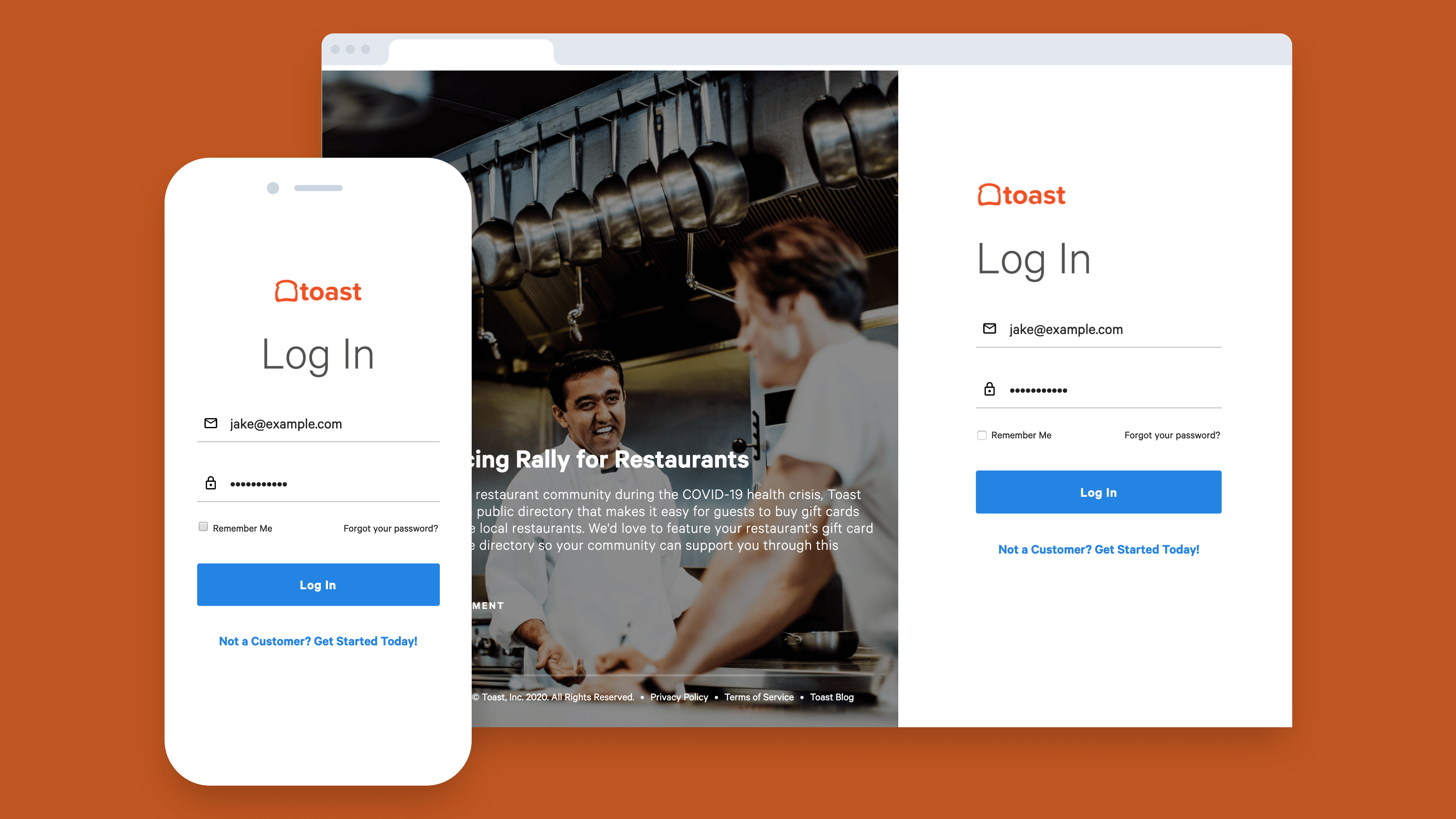
Scale without drift between design and code.
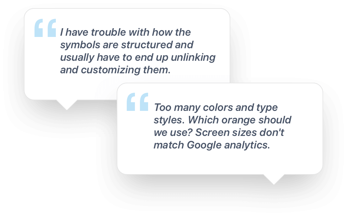
Toast's existing Sketch library was inconsistent with what shipped. Designers could not find components, mobile patterns were missing, and dev teams were rebuilding the same UI with different specs. A survey of the product design team shaped the structure and adoption plan.
- Designers could not find components they needed in the Sketch library
- Mobile-specific patterns were missing or outdated
- Discrepancies between Sketch components and coded UI
- Components were hard to edit and customize
- No shared process for requesting or tracking new components
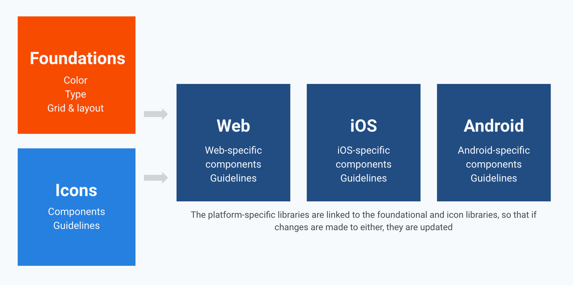
- Separate Web, iOS, and Android libraries plus shared Foundations
- Sketch for Teams workflow with aligned foundational tokens
- Storybook library with Tailwind-based specs in Zeplin
- Bi-weekly syncs, Slack channel, and UI office hours for the system
- Component request doc and KPI tracking for adoption
Design process
Formulating a structure
Research informed a library architecture that started fresh with widely used, well-built components and separated foundational tokens from platform-specific patterns.
- ·New library file with components used widely and built correctly
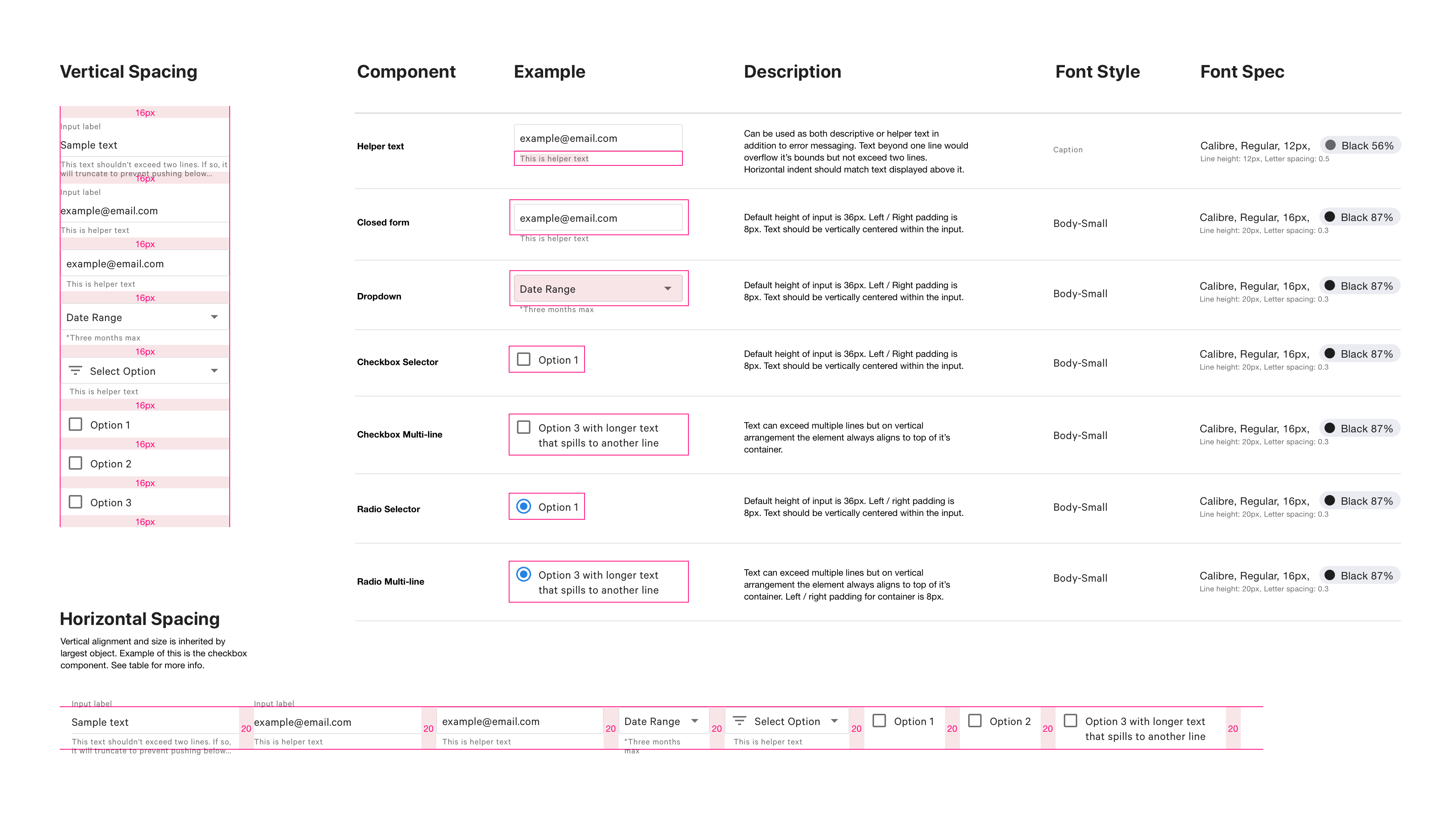
- ·Foundational colors, fonts, grid, and layout in a dedicated Foundations file
- ·Separate icon library; close partnership with dev on coded parity
Optimizing the Sketch libraries
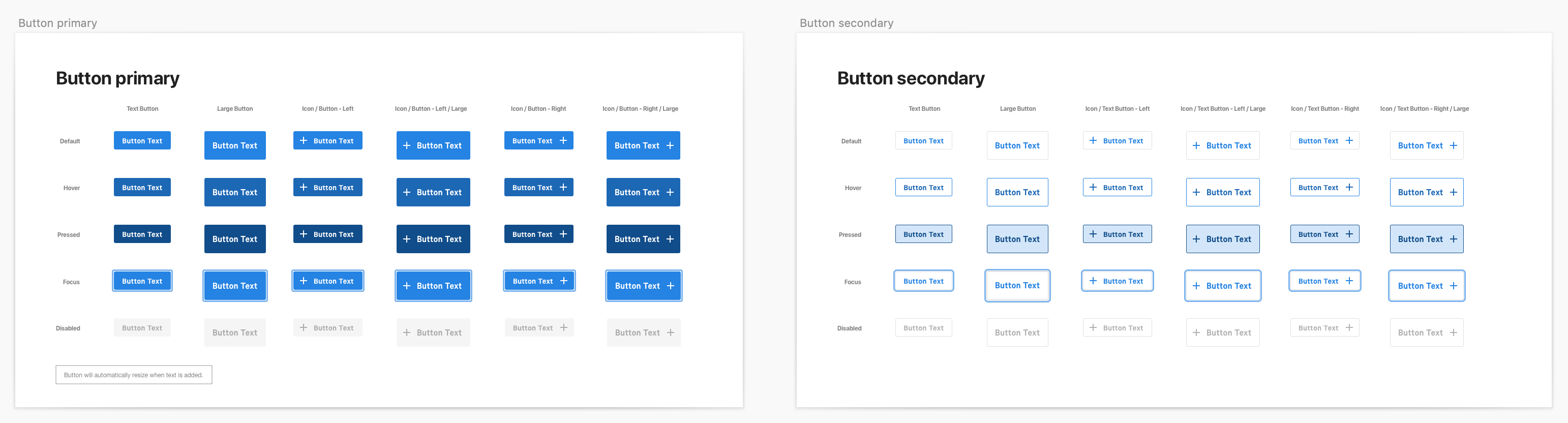
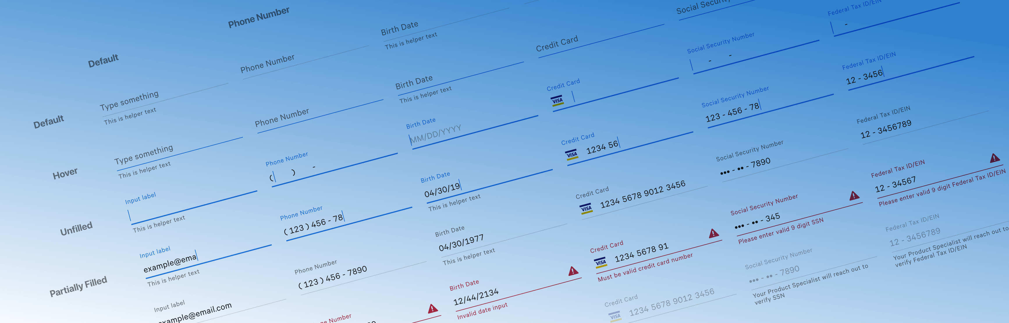
Three platform files (Web, iOS, Android) plus a platform-agnostic Foundations file, shared via Sketch for Teams so design stayed synchronized.
Storybook and Zeplin for developer collaboration
Frontend specs and CSS properties in Zeplin used Tailwind utility naming aligned to brand colors, typography, and spacing. Properties fed into Storybook so devs could build SPAs from the same source.
Research-driven structure
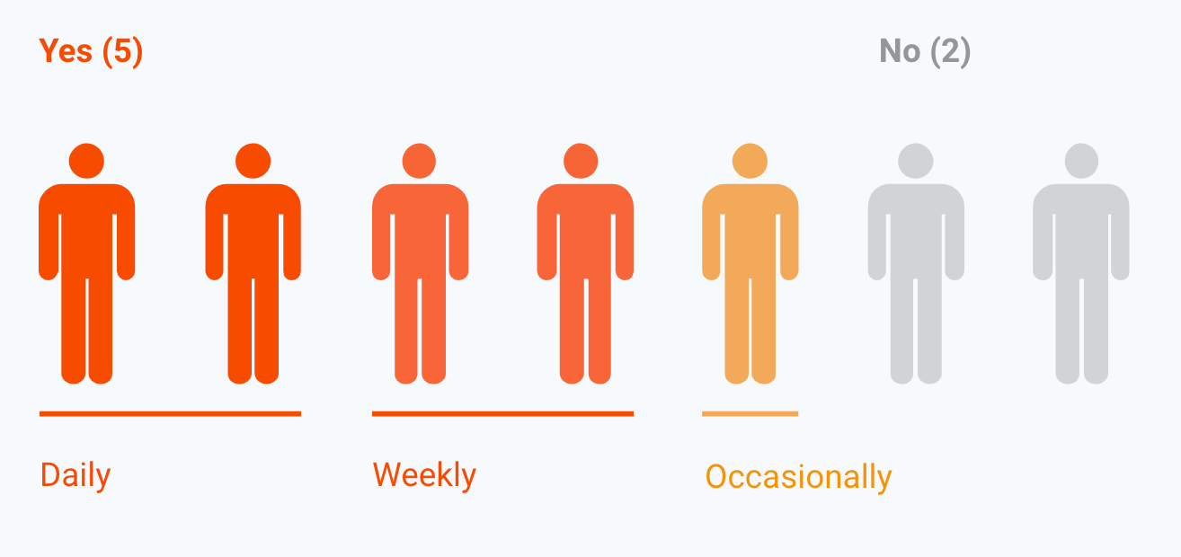
A product design survey answered whether the team used the Sketch library, which components were most used, why designers avoided the library, and what would increase adoption. Buttons, icons, form elements, colors, and font styles topped usage; findability and dev parity were the main blockers.
Collaboration toolset
Component request and development doc
Central doc for proposing, scoping, and tracking new components through design and engineering.
Bi-weekly stakeholder sync
Regular review for all teams consuming the library to surface gaps, conflicts, and upcoming needs.
Design System Slack channel
Always-on channel for questions, announcements, and quick alignment on system decisions.
Weekly UI office hours
Open session for in-depth discussion of patterns, edge cases, and implementation details.
Results and learnings
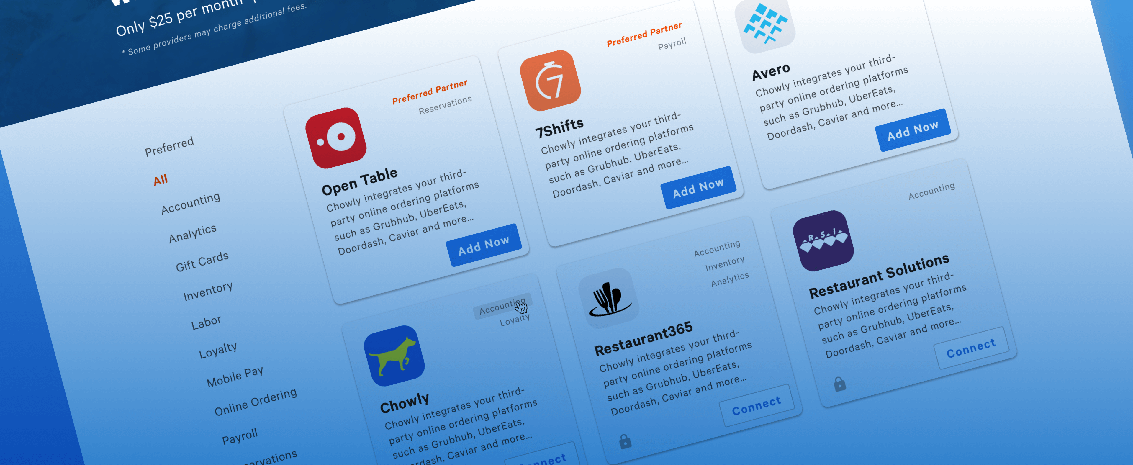
The Design System delivered a more scalable, cohesive visual experience across Toast web products. Ownership rituals and collaboration tooling kept the library current as new features shipped.