Role
UI Design
Methods and tools
Sketch
Principle
Tailwind CSS
Storybook
Zeplin
Overview
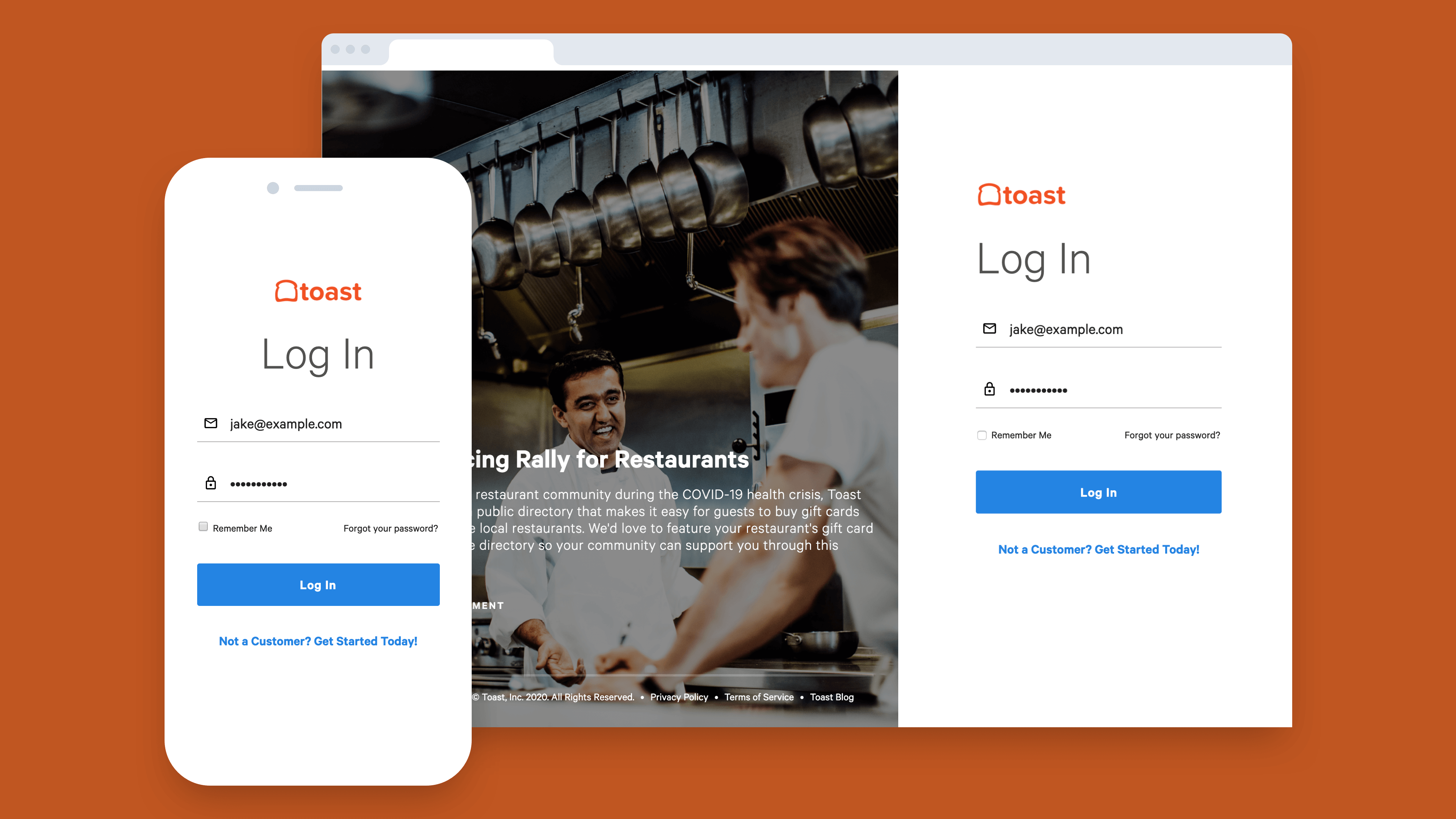
As Toast's web product was moving from Bootstrap and Angular to an entirely React based framework for SPAs and components, the design team needed a system in place that would allow teams to scale alongside that effort and components and code were cohesive across the board. It was also imperative that if any new features or components were created in the future that those would also be included in the pattern library. We set a timeline of one quarter for the initial effort.
Discovery and research
In order to assess the feasibility of a comprehensive design system and to find out the most efficient method to improve design and developer collaboration we conducted a survey with our product design team to find out how many were currently using our existing pattern library in Sketch. The goal of the survey was to identify ways that we could increase adoption and integrate Sketch components into the design system. The survey intended to answer the following questions:
1. Does the team use the Sketch library?
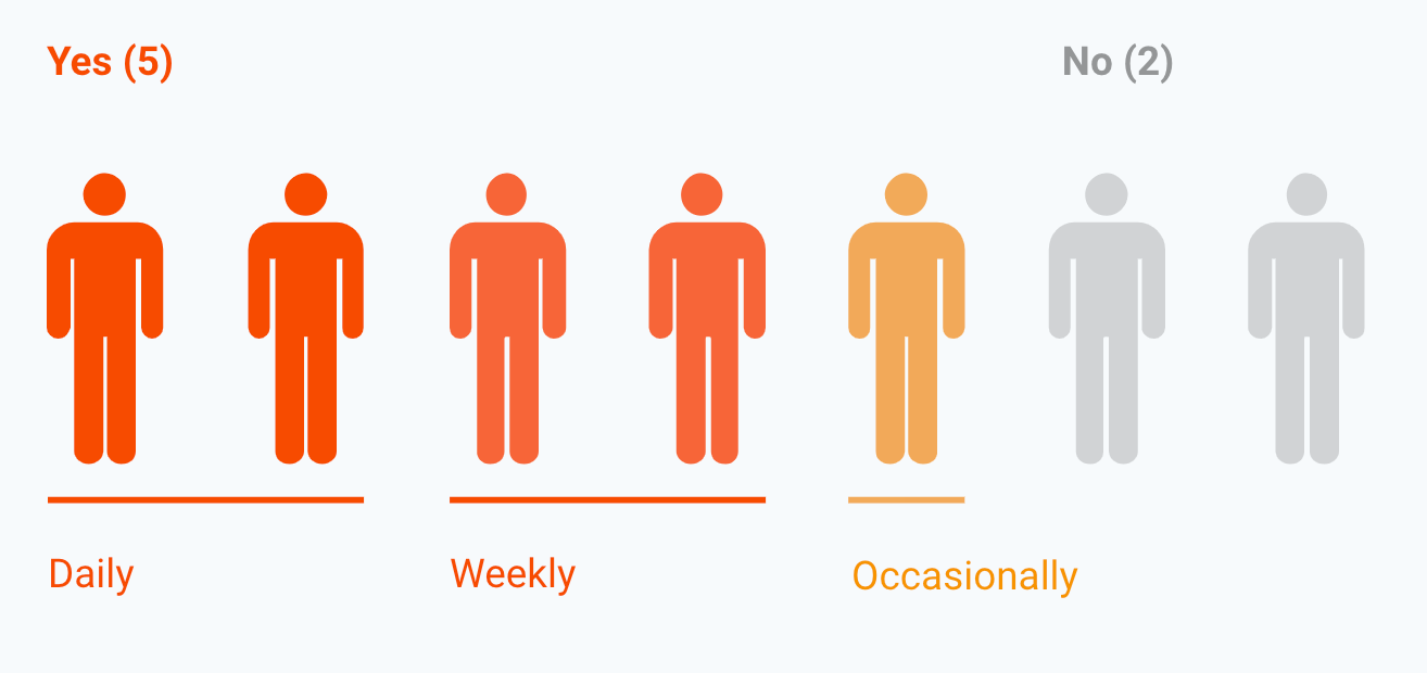
2. If so, what are the most widely used components?
The most widely used design components were the following:
- Buttons
- Icons
- Form elements
- Colors
- Font styles
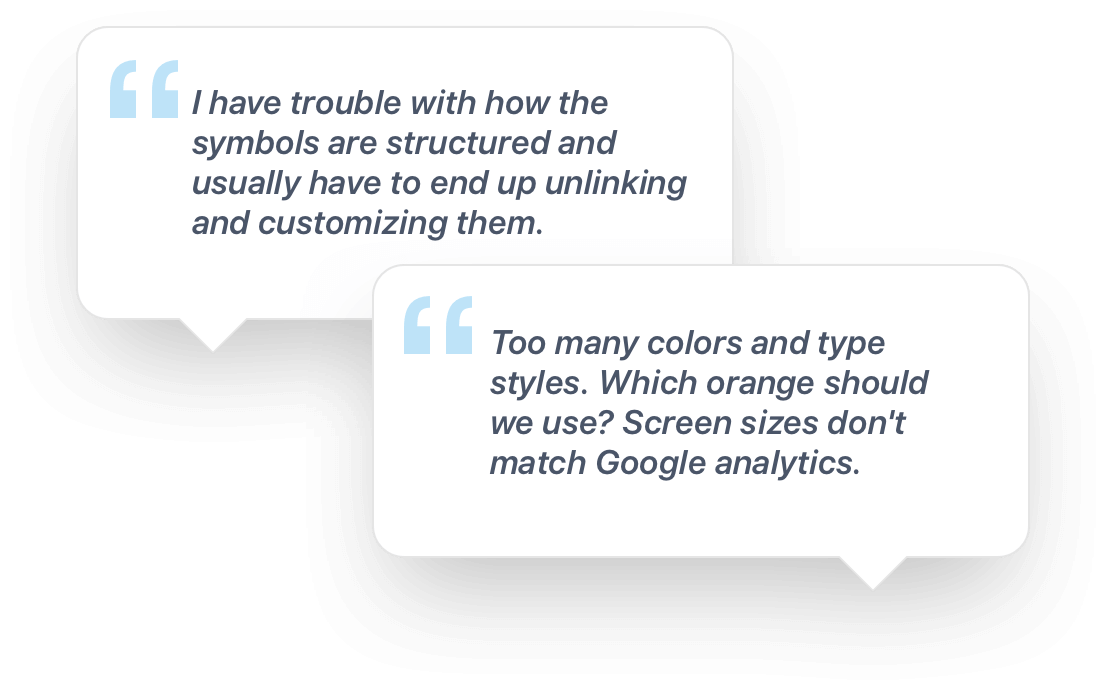
3. Why are designers not using the current Sketch library?
These were the main reasons designers were not using the component library:
- Couldn’t find what they needed
- Doesn’t have mobile-specific items
- Some discrepancies between coded and Sketch components
- Components are hard to edit
- Does not match what is being built on the dev side
4. What would increase usage and adoption?
The following answers gave us a look into what might increase adoption:
- Simplification of the current library; take out items that no one uses
- Reduce color and font styles
- Create separate libraries for platform-specific patterns and components (iOS and Android)
- Make components scalable for various form factors
- Make components easier to customize
- Add guidelines so you’d know when or how to use elements
The design process
Formulating a structure
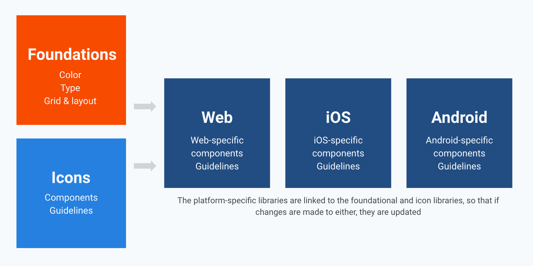
Based on the research we formulated a structure for the design system library that would include the following considerations:
- Start a new library file with the components that are built properly and used widely
- Take only those foundational elements (colors, fonts, grid and layout) that are used widely out of the current library and create a separate library for them.
- Adjust or rebuild any foundational components to work as intended.
- Create a separate library for the icons that are used widely.
- Work closely with dev teams to keep the library aligned with the components they code
The design process
Design and developer collaboration
Based on the results of our survey I began the process of creating a comprehensive design library and design system utilizing Sketch and Storybook. In addition to the actual UI design, we needed to have a set of tools in place to collaborate, measure KPIs and keep ongoing engagement on its development.
The design system collaboration toolset:

Component request and development doc

Bi-weekly sync for all stakeholders utilizing library

Slack channel for Design System communication

Weekly UI Office Hours for in-depth discussion
The design process
Optimizing the design library
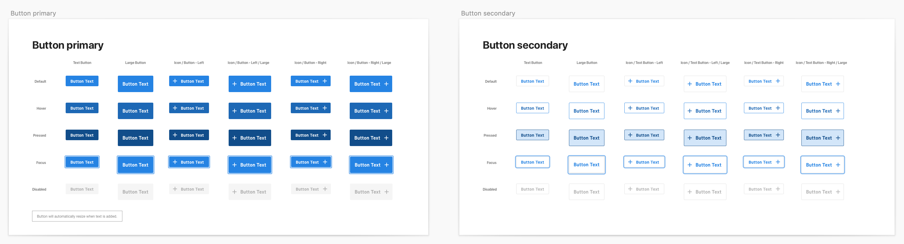
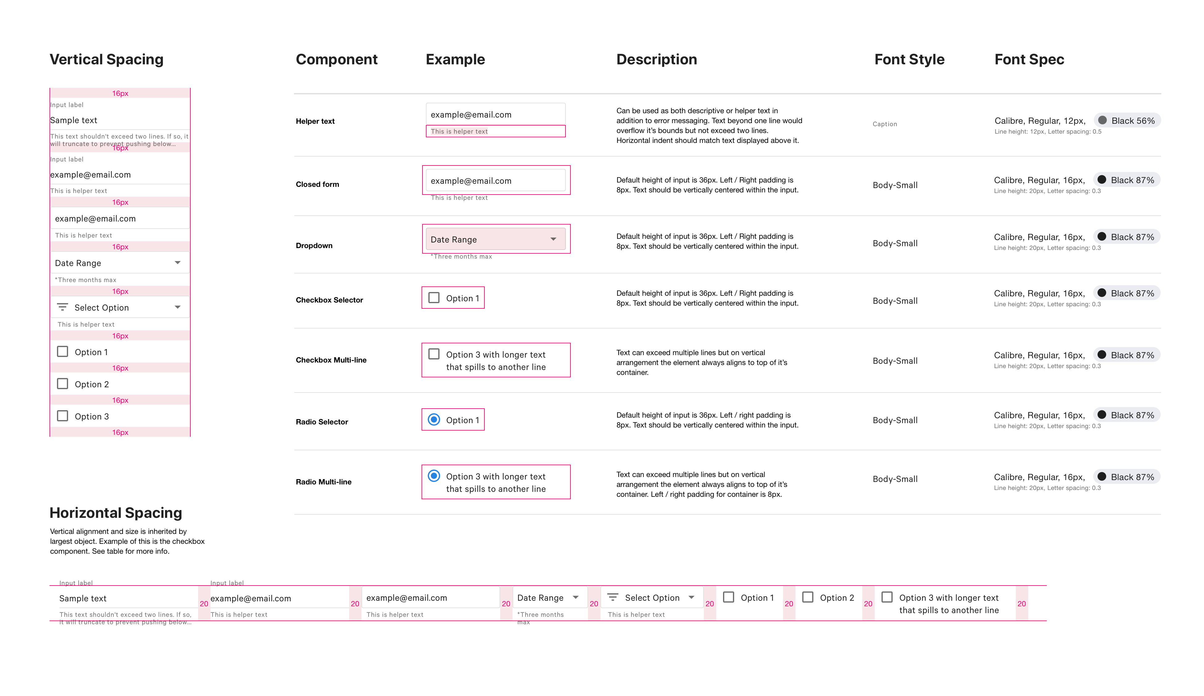
The main component of the Design System for the product design team are the Sketch libraries. As I discovered in our research, the existing library lacked cohesiveness with the code base and it was a challenge to determine the best approach for UI in product designs; slowing down productivity and providing unnecessary tech debt.
To solve this I created three separate files utilizing components specific to Web, iOS and Android. In addition I created a comprehensive Foundations file which included colors, typography and iconography which is platform agnostic. In order to effectively share and collaborate on these files we utilized Sketch for Teams.

The design process
Storybook and Zeplin for developer collaboration
With an optimized design library in place I needed to assure design and developer collaboration was seemless. I worked with our frontend developers to provide new component specs and CSS properties in Zeplin. Properties were based on Tailwind CSS utility classes and I was able to customize naming conventions to match our brand colors, typography, spacing, etc. All of these properties were then implemented into the Storybook library so the dev team could effectively build components for SPAs.
The result and learnings
Cohesive, scalable and iterative
The implementation of a comprehensive Design System at Toast resulted in a more scalable and cohesive visual experience across our web based products. It was a necessary step to ensure product design is consistent and developers could reduce the guesswork associated with adding features.
A key takeaway that I learned from this process is that ownership is critical to maintaining a successful design system. By putting a toolkit in place for collaboration it gave our team accountability for it's success. These were some of the KPIs we achieved as a result:
- Uptick in usage and adoption within Product Design team
- Improved communication for issues or questions related to the library
- Better overall tracking for adding new components and requests
- More consistency of designs across SPAs and product teams
- Less redundancy in the code base
- Better overall usability for the end user (our customers)