Role
UX/UI design
Methods and tools
Sketch
Principle
Invision
Zeplin
Overview
Toast’s Online Ordering is a robust out of the box white label experience which gives guests the ability to easily order directly from restaurants for pickup or contactless delivery. This allows restaurants to fulfill orders without third party fees. Although this product represents a significant portion of revenue for restaurants, customers were reluctant to utilize it based on its lackluster design, challenging UI and limited custom branding. In addition, it was built on an Angular platform. Since we were moving to a React based framework, we had a great opportunity to create a cohesive user interface, improve loading speeds and optimize it for mobile usage.
Discovery and research
Our team began by conducting interviews and compiling quantitative research from our users to find the primary areas of concern for the existing product. We put together a roadmap of the MVP release based on those findings. The design sprints focused on improvements in four key areas of the product:
- Restaurant page and menus
- Details page (modifiers)
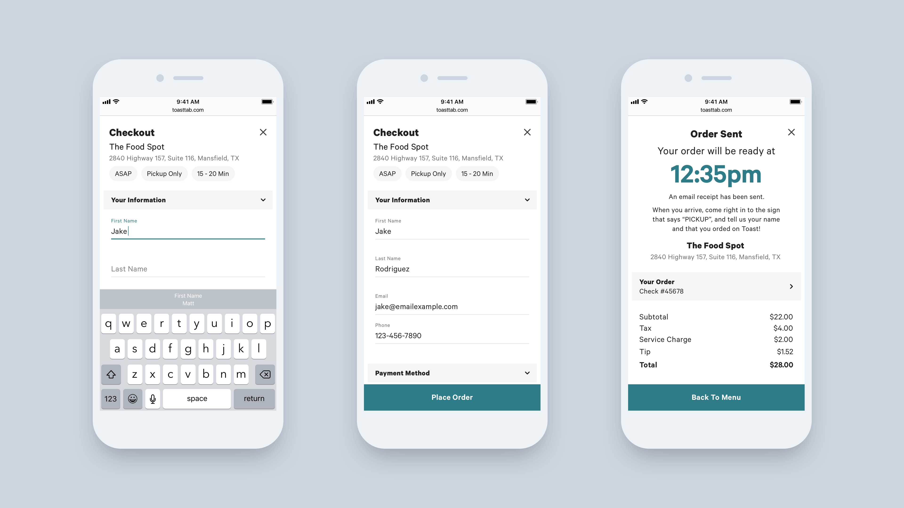
- Cart
- Guest checkout
In order to streamline development, I worked with our front end developers to audit existing patterns to prepare us for the updated design language and conversion to React based components. I also collaborated with our lead product designer on wireframes and information architecture before moving to high fidelity visual design.
The design process
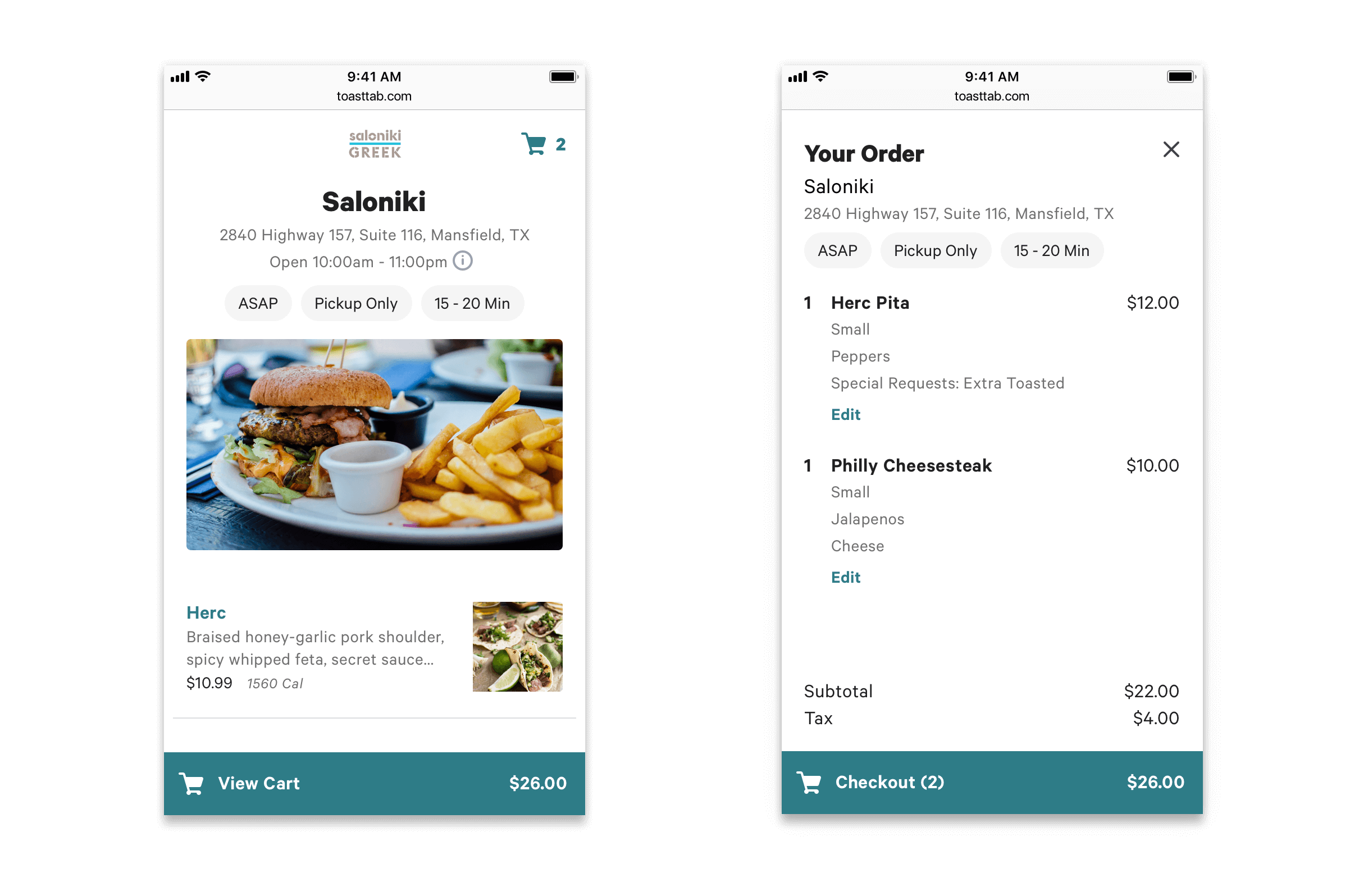
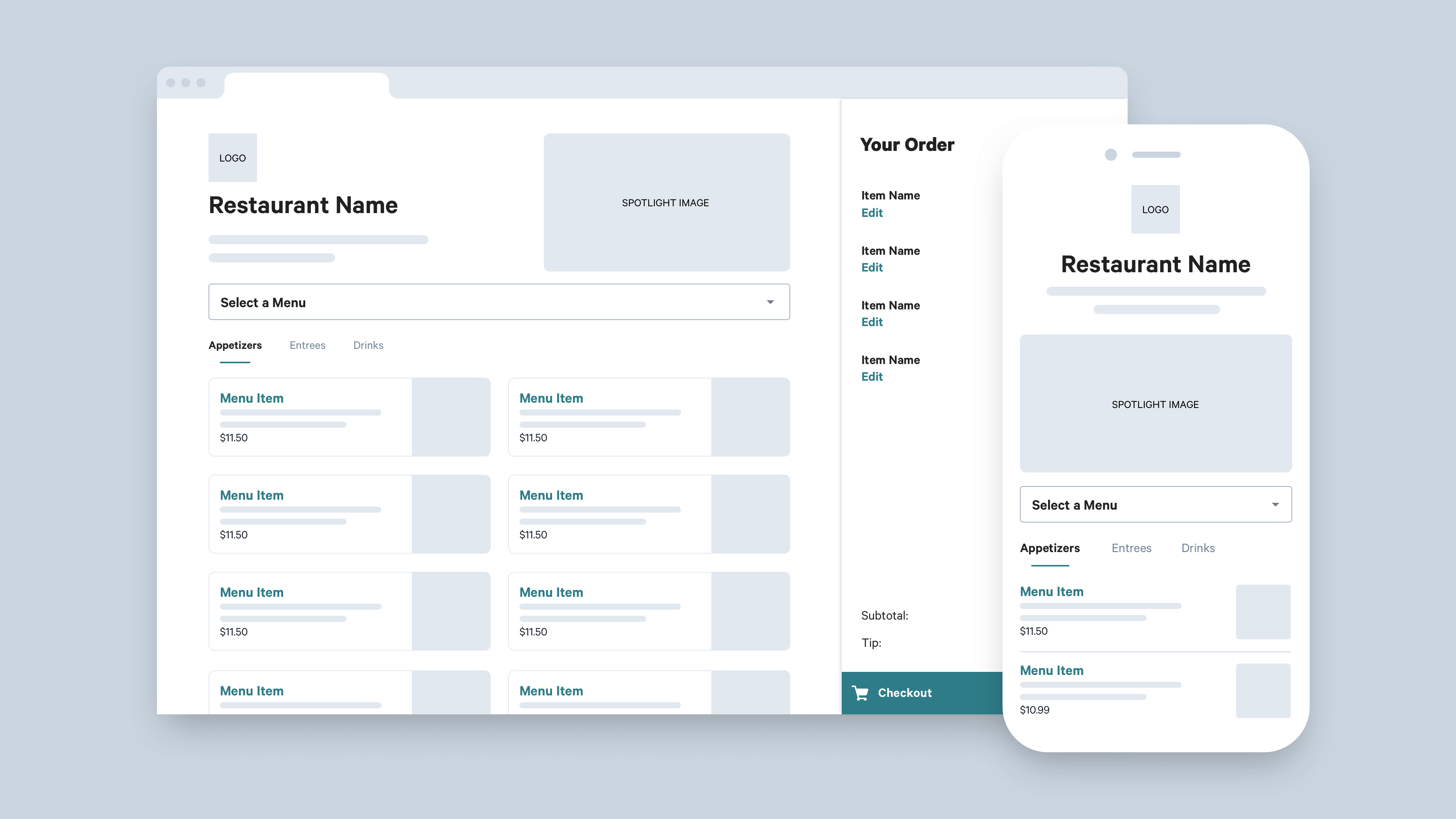
1. Restaurant page layout and exploration
The legacy version of Online Ordering included a landing page which we found was preventing users the ability to quickly browse menu items before selecting their method of delivery or pickup. So we went to work on a newly thought out landing page which included the ability to select method of ordering while immersing the guest in the restaurant menu. I explored several different concepts to utilize elements of the page, including spotlight photo, cart placement and menu item location.
The design process
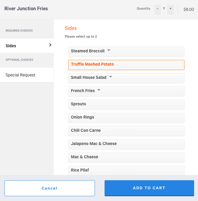
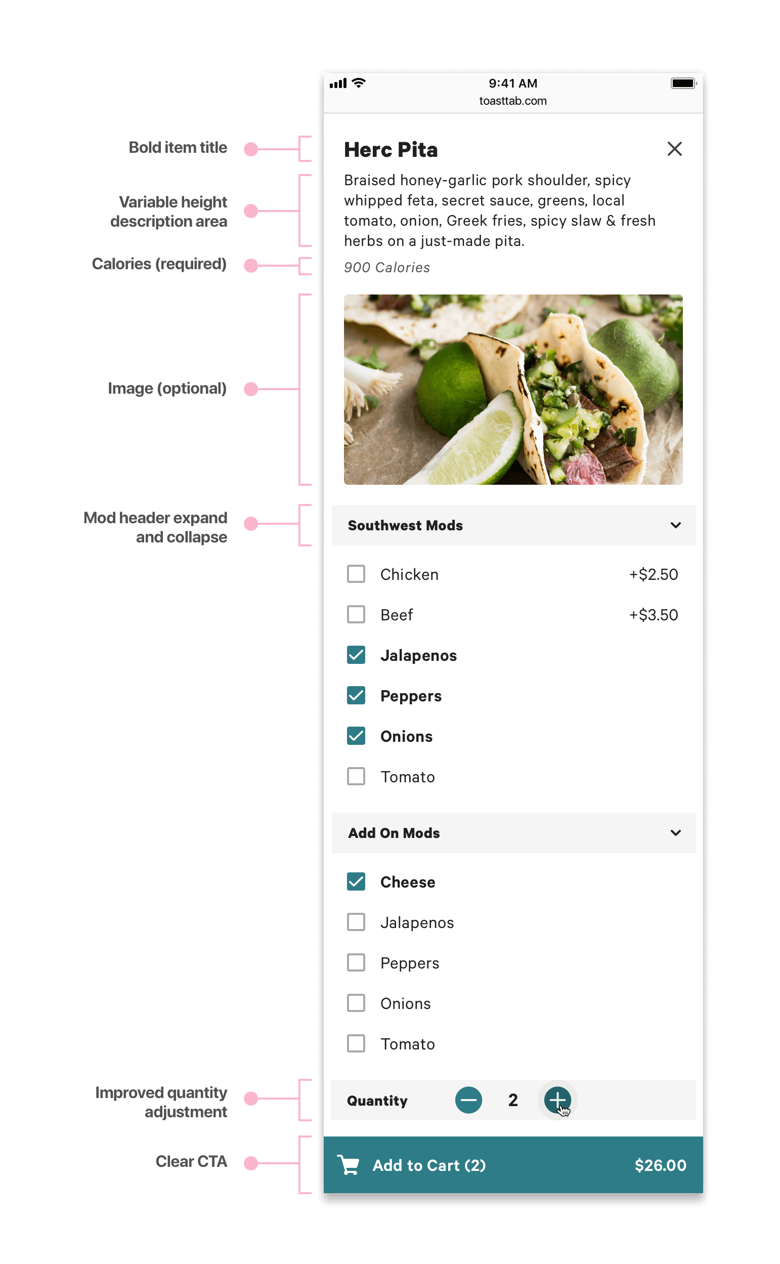
2. Item details - Making modifiers the star
When a guest clicks on a menu item they are given a screen with several modifier options, depending on the item. Based on quantitative data and user interviews we identified the main problems with the legacy version were:
- Lack of hierarchy and embedded modifiers
- Inconsistent treatment for required modifiers
- Clunky UI with no room for item photo
- Not mobile optimized
The resulting design put a greater focus on mobile first and more clear selectors for modifiers. We also included an area to include a photo utilizing item images in our existing database and increased visibility of the item header.
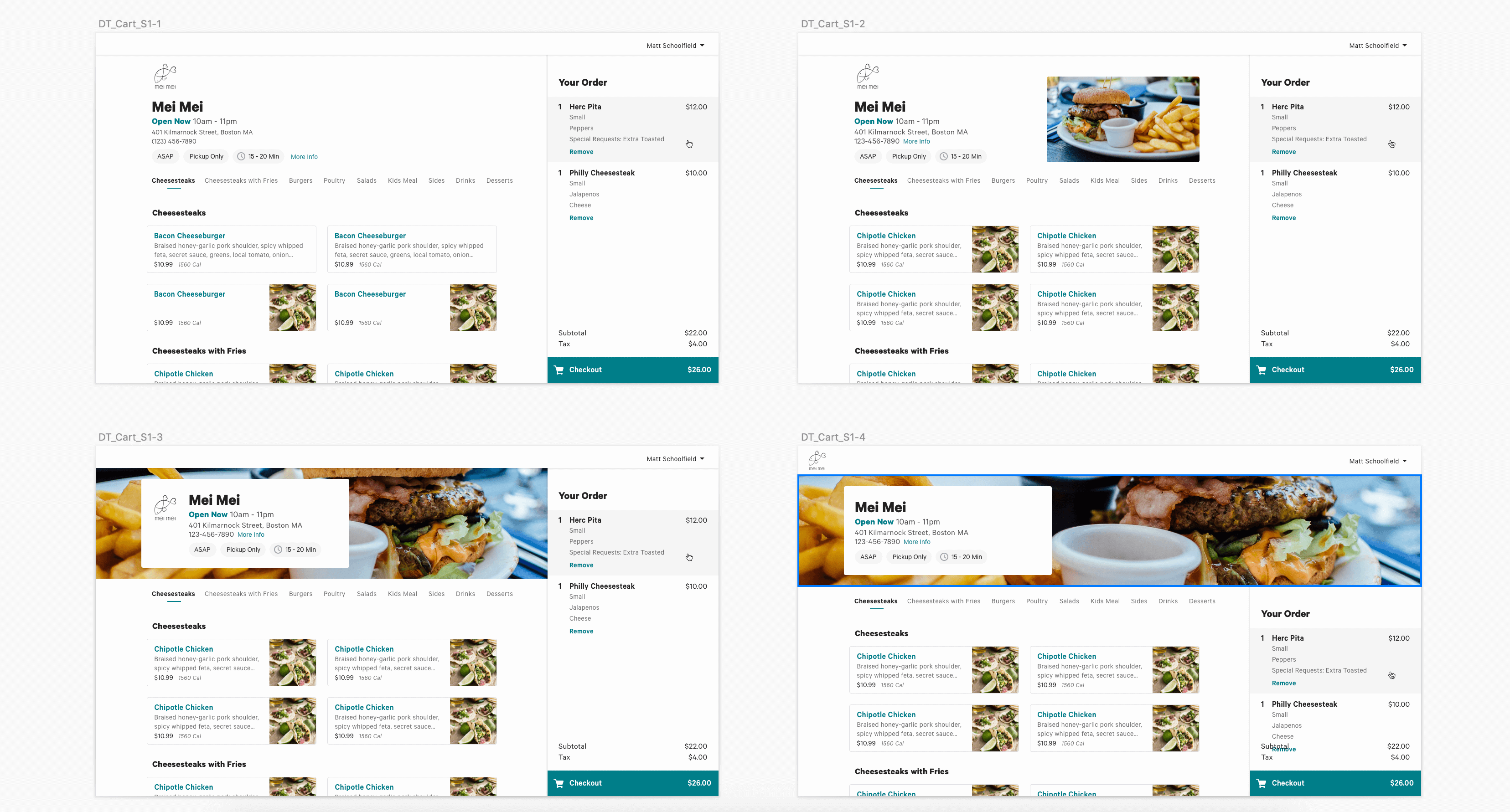
Legacy modifiers
In this legacy screenshot the two column approach was not optimized for mobile usage. Users also struggled with expand and collapse items to see embedded modifier options.